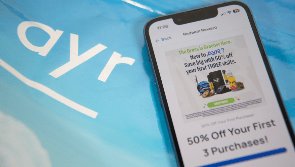
In today’s fast-paced digital world, catching a customer’s eye in milliseconds is crucial. Whether you’re selling cannabis products, skincare, or sneakers, the way you present options on your website or mobile app can significantly influence consumer behavior. One of the most debated questions in e-commerce design is: what drives more clicks—product images, icons, or plain text? Let’s break it down.
Product Images: The Visual Magnet
There’s a reason platforms like Instagram, Amazon, and countless cannabis e-commerce menus prioritize images. High-quality product photos can instantly convey texture, color, size, and brand identity. Studies show that consumers process visuals 60,000 times faster than text. For cannabis retailers, a clear image of a pre-roll pack, vape cartridge, or edible can reduce shopper hesitation and increase product trust.
When users are browsing quickly, a thumbnail image offers a rapid understanding of what they’re about to click. This becomes especially important on mobile devices where screen real estate is limited. A well-lit product photo can also trigger emotional engagement—when shoppers “see” themselves using it, they’re more likely to add it to their cart.
However, images have drawbacks too. Poor image quality, inconsistent sizing, or cluttered backgrounds can actually deter clicks. In some regulated markets, retailers may face limitations on showing actual cannabis product images, forcing them to rely on alternatives.
Icons: The Middle Ground
Icons are a minimalist way to deliver visual cues without the load time or licensing complexity of real product photos. In cannabis menus, icons representing flower, concentrate, tinctures, or edibles offer a clean and fast visual guide for users to understand categories.
Icons work best in navigation or when used as supplementary elements alongside text. They’re universal, fast loading, and efficient. But on their own, icons lack the specificity needed to drive action. An icon of a brownie doesn’t tell a shopper how potent the edible is, who made it, or what flavor it offers.
For UX designers, icons serve a functional role—they guide, hint, and organize. But when it comes to generating clicks, they’re usually a supporting act rather than the main draw.
Text: Still Relevant but Often Ignored
Text plays a crucial role in labeling, accessibility, and SEO, but it generally underperforms when compared to visuals in attracting immediate user attention. In cannabis e-commerce, descriptive product titles like “Lemon OG Live Resin – 1g” provide vital context. But without a photo or icon to reinforce that label, text alone often gets skipped.
That said, text becomes powerful when paired with smart formatting—bold fonts, color contrast, and concise wording can help headlines and product names pop. In particular, text is effective in list views, where users are comparing attributes quickly.
The Verdict: Visuals Win, but Synergy Is Key
Across the board, product images tend to generate the most clicks, followed by icon-supported designs, with text-only layouts trailing behind. But the most successful interfaces often use a hybrid of all three—leveraging high-quality images for attraction, icons for fast navigation, and text for clarity and detail.
For cannabis dispensaries or any digital retailer, testing different combinations through A/B experiments is key to finding what drives engagement. Visual storytelling wins the click, but thoughtful design keeps the customer coming back.

